App Prototypes and Mockups

iPhoneApp

After you have decided on an iPhone app, most people proceed to transfer their idea and vision directly to a developer to build the app for them. Before this step though, it is recommended that you create a prototype of the app first, that you can play with on your own. This will help answer a few questions for you, regarding your app.

  • Does the app make sense to use?
  • Are the steps you take to accomplish tasks logical?
  • If some tasks require too many steps, are there any ways you can reduce the number of steps to make the app easier to use?

Chances are that when you actually start seeing the mockups in place, you will realize that some pages and options don’t make sense in their current position and will need to be changed. It is much easier (and cheaper) to figure this out in the early prototype stage, than after you have begun development.

So how do you build an app prototype? You could get a designer involved here if you wanted. You could then:

  1. Sketch out the design and individual screens yourself on pieces of paper. Take photos of the papers and send them to your designer with an explanation.
  2. Skip the sketching and just type out your vision of what the app should look like, and send it to your designer to create mockups.
  3. Find examples of other apps with similar layouts or look and feel to what you’re looking for and send these examples to your designer.

Want to save even more time and money?

Before you ask your designer to create mockups, you can try creating them yourselves. There are several apps and websites out there that help you create and design prototypes of apps. Here are a few popular ones:

The above tools let you create interactive prototypes of your app in one of two ways:

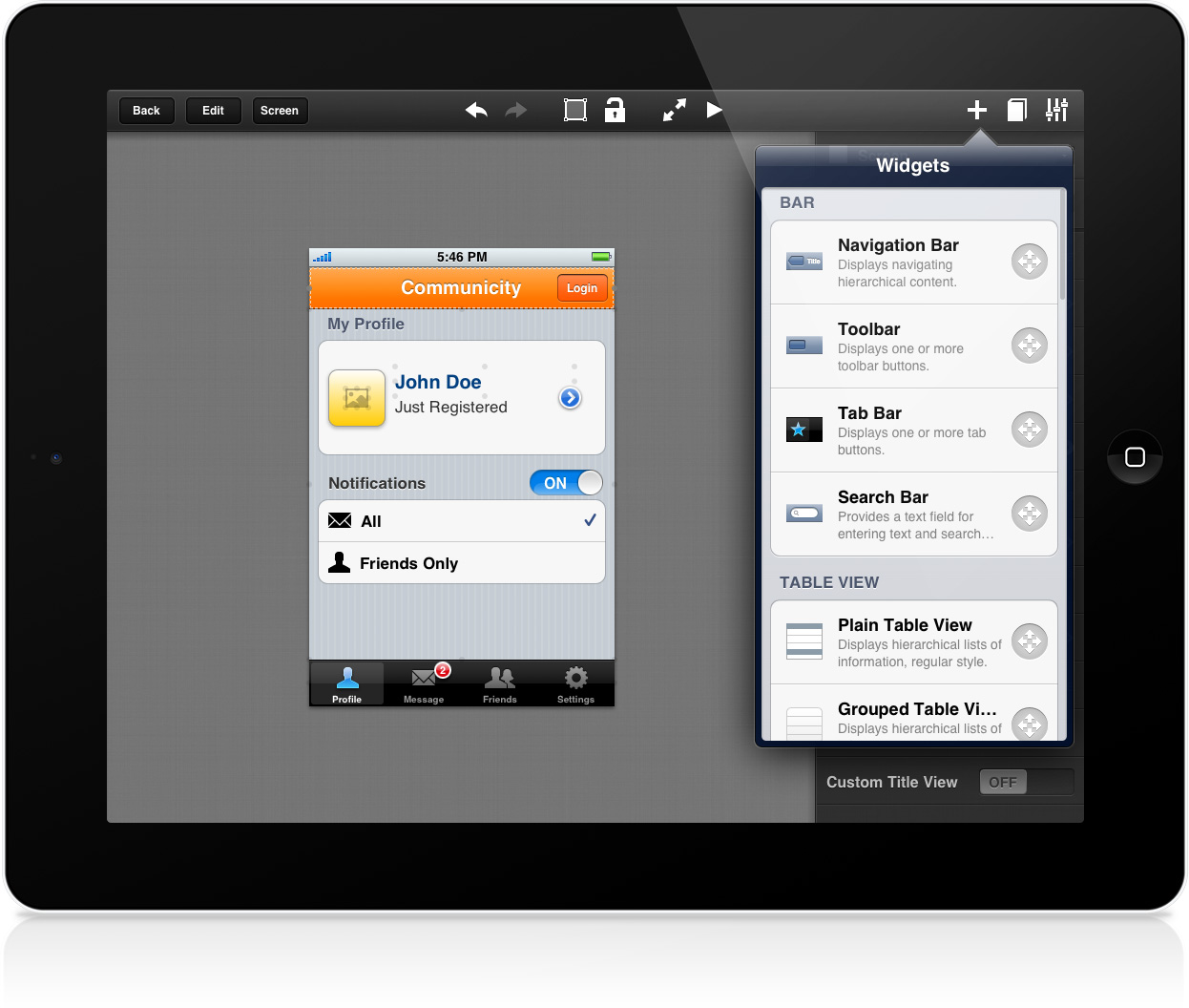
  • Pick and choose common iPhone / iPad UI elements (buttons, sliders, fields) and place them in the right position.
  • Upload your own screenshots or sketched mockups

Once you have the various screens created, you can then link them together – you define which screen the prototype goes to when a certain button is pressed. This way, you can get a concept of what the whole app may feel like by clicking on different buttons and going from mockup screen to mockup screen. If a process doesn’t feel right, edit the layout or flow until you are comfortable with the overall process.

iPad Mockup

Once you are comfortable with what the early version of your app is like, you can either send your prototype to your designer to map out the look and feel of the app (logo, color schemes etc.) or send it directly to your developer to get started on.

It’s worth honing your skills on creating mockups and prototypes since they are a great way to sketch out ideas and even test the viability of certain app ideas early on. You may find that during the prototyping stage, the problem you are solving is too complicated for a single app. Or perhaps it should be broken down into separate apps. Either way it is much better to figure out such issues early on, rather than when you’re already late in the development process.

How to Make an iPhone App

Rich App Developer

So, you want to be an app developer?

People approach me all the time with ideas for the next great iPhone app. Everyone knows how popular mobile app development is these days, so it’s natural to want to get a little piece of the action for yourself. We keep hearing stories of indie developers making big money with apps. If he can do it, why can’t you?

My recommendation is to get your feet wet first, before you try to swim in the deep end.

  1. Start with a simple app, that won’t cost an arm and a leg to develop. See what you think of the process.
  2. Did you enjoy it? Made any money from it? If so, then reinvest into a more complicated app that could potentially make you even more.
  3. Learn from your mistakes.
  4. Rinse and repeat this cycle.
  5. Profit!!

So how do you get started?

Well first, you’ll need an idea for that first app. One that can make you a few bucks that can be reinvested into future projects.

I’ve created a 13 page PDF guide that details the steps involved to come up with that first idea. Here are the topics covered:

  • The Mobile App Economy
  • Choose a platform
  • Coming up with an idea.
  • Researching App Stores for Competing Apps.
  • Pricing Models.
  • Finalizing Your Mobile App Idea.
  • Choosing your Final App Idea

Sign up on the right sidebar to receive a FREE copy of this eBook, along with other tips, tricks and resources to help you make your iPhone apps.

Good luck in your journey!

How to Get More App Downloads

Once you have released your mobile app, and you are happy with its quality, your goal should be to maximize downloads and revenue. How do you do that?

1. Increase your Conversion Rate

Manage your iPhone Contacts

All users will be downloading your app from an app store link. So it’s in your interest to make sure that your app icon, description and screen shots do the best job they can, to convey what your app is about. From time to time, revisit your app page to see what it looks like there. Apple and Google are constantly making updates to their stores, so it’s in your interest to make sure that your app is being portrayed in the best possible light.

For example, Apple now shows search results of apps with only one screenshot at a time. What screenshot is showing for your app? Does that screen encompass what your app is all about?

What copy is being displayed above the “Read more” button? Does it make potential users want to click to find out more?

Experiment with different sales copy to see if it makes any difference to your downloads.

2. Experiment with Pricing

After experimenting with your sales copy, the next thing you can do is to experiment with pricing strategies. If you lower the price, that should result in more downloads, but less profit from each sale. Figure out what price point generates the most revenue for you.

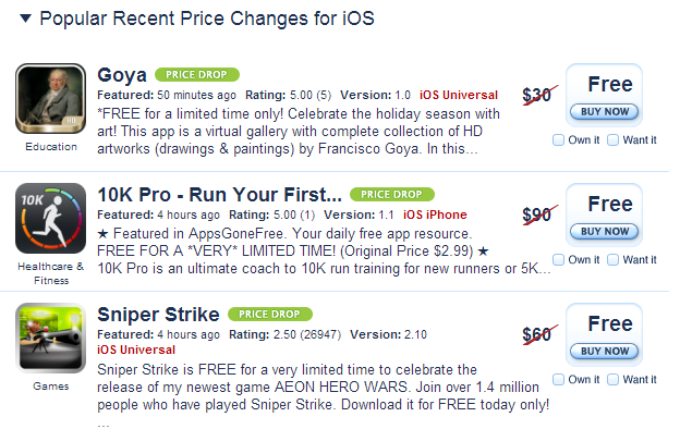
From time to time, you can also put your app on sale to generate publicity. There are many sites out there that track app pricing, and will notify users when apps like yours go on sale. Take advantage of sales bumps you may get from different promotions throughout the year.

App Price Drop

Another strategy you can try is to just make your app free for some time to generate buzz. This can be great to increase the number of reviews you have, or you can hope that word of mouth sales can help you later on, when your app is not free anymore.

3. Increase Traffic

You can have the perfect sales copy and even a free price tag, but if nobody is visiting your app store link, then it won’t matter. Depending on the niche, you can try promoting your app on different forums that your target users may visit. Make sure you have submitted your app to relevant review sites as well. Lastly, you can consider paid traffic to see if that helps as well.


How Your App Can Benefit from Your Competition

Manage Contacts on your iPhone

With over a million apps on the app store already, chances are good that the app you are creating or want to create already has some competition for it. Most people view competition for their as a bad thing. After all, they are taking away potential users from your own product, right?

However, if you look at it from a different perspective, competition can actually be a good thing!

  1. They validate your product. If you see competitors in your space, you want to first see if they are doing well or not. If they are doing well, that suggests that there is demand for such products. How do you know if they are doing well? Look for chart rankings, and lots of reviews that suggest user interest.
  2. They suggest marketing strategies. If a competing app is doing well, then find out how they are marking themselves. Are they using ads? If so – where are they advertising? Have they been reviewed by any top sites? What kinds of sites are linking to them? Are there similar strategies you could use to promote your own app?
  3. You can steal their user feedback. Read reviews of competing apps to learn what users like about their product, and what areas can be improved. There might be certain features that users are demanding that you could add to your own app to differentiate. I used this same approach when I created my first product.
  4. They suggest pricing strategies. What price are they selling their app at? Are there in-app purchases? Do they seem to be making money from this app? (You can find out by looking at the top grossing apps for their app category).
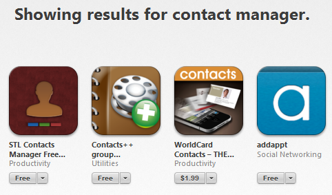
  5. They suggest keyword ideas. What keywords are your competitors using in their app titles and descriptions? If users are already searching for these keywords, then you want to be part of the results. However you also want to have something unique about your app to differentiate from competitors. That was the thinking behind the title of my STL Contact Manager  app. It shows up in searches for “Contact Manager” but also has the unique “STL” part, in case someone wants to search specifically for my app. The last thing you want is for someone to search for your app, but not be able to find it, among competing apps.

What can you learn from the apps that are competing with you right now?

App Store Icon

One of the most important aspects of creating a successful app is to make sure it has a great icon. With over a million apps now on the app store, it is getting harder to stand out. Users are now accustomed to scanning through pages of app icons, while looking for apps that appeal to them. Icons that stand out get noticed first. So if your icon does not stand out, then it becomes harder for a user to discover your app.

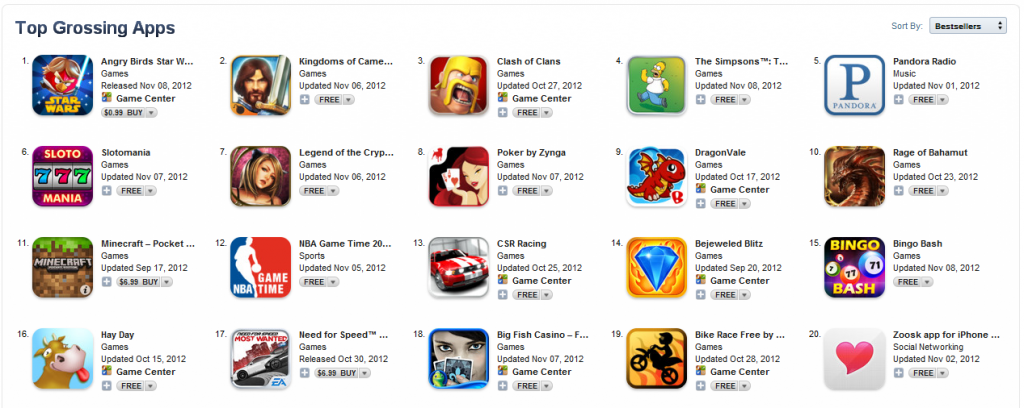
Here is a screenshot of icons from the the top 20 grossing app store (Apple) apps (when in doubt, always turn to this list).

App Store Icons


What can we learn from them?

  1. Many of the icons don’t include text, since the title of the app is already provided next to each icon.
  2. By default, Apple applies a glossy effect to the top half of icons. Here is an example: Glossy Icon Notice how most icons turn that effect off though.
  3. Most of the icons are quite colorful, in order to better stand out from the pack.
  4. Each icon tends to have a single picture or theme, with the focus around that. The user should be able to guess what the app is about by looking at that picture – which would then be supported by the app title next to it.
  5. Although most icons use a cartoon like picture, the pictures are quite detailed with elaborate shading and shadow effects. Putting this much effort into a proper app icon suggests to the user that they can expect a similar amount of detail and polish in your actual app as well.
Want more inspiration. Here are some examples of nice icon design. How does your app’s icon measure up to these standards?


How to Submit your App to a Review Site

Mobile App Review SitesNowadays, in addition to creating a great mobile app, you also need to actively market it, in order to help people discover it. A great place to start is by submitting your app to an app review site. There are a few reasons to do this, some more obvious than others:

  1. It exposes your app to users who might not have known about your app otherwise.
  2. In addition to exposing your app to potential users, it also exposes your app to other review sites who may also be interested in reviewing it.
  3. Each review of your app provides a link to your app’s app store page, which helps it rank in search engines.

Depending on the size of the app review site, they may not accept all submissions – choosing only to feature some apps over others. What kinds of qualities do they look for, when choosing what apps to feature?

  1. Is your app unique enough? Does it provide a unique twist from other similar apps? If your app is a knock-off of another app, or does the exact same thing as several similar apps, then it is less likely to be chosen to be reviewed.
  2. Does your app look visually appealing? Reviews usually feature several screenshots from the app – so if your app has a great design, its screenshots will enhance the review. Conversely, apps with a plain and boring design are less likely to be featured.
  3. Is it a quality app? This goes without saying. If your app is constantly crashing or has usability issues, then the app is likely to not be featured (which may be better than giving you an unfavorable review).
  4. Is the app easy for them to review? The easier you make it for the reviewer to review your app, the more likely it is to be featured. If you are missing crucial information like screenshots, a link to the app store etc. the reviewer might choose to skip your app, and review another app that does have all this information provided.

Assuming that the review site does choose to review your app, it would be in your interest to make it as easy as possible for them to review your app. This includes providing them with all the following:

  1. Your app icon, description and screenshots that they can use. Yes, they can get this information themselves from the app store, but save them the trouble by providing it to them directly.
  2. Links to all the app stores where your app is posted. You want to make it easy for their readers to access your app.
  3. Login details for guest or test accounts that they can use, where required. Yes, they could create a new account, but again, go the extra mile by providing this information to them.
  4. A download code, letting them download your app for free. Obviously reviewers can’t be expected to purchase all the apps they review on their own.
  5. A video summarizing all the key areas of the app. Some reviewers won’t have time to test all the areas of your app themselves. A video summary gives them an idea of what areas they may have missed, or should focus on, in their review.

Take a look at some of the other reviews that the site has done, to see if you are missing anything. Some reviews offer free download codes to their readers. If they do, find out how many they need and provide these to them as well.

Ready to get started? Here is a list of 168 different app review sites that you can start approaching. You won’t be able to approach all of them – the bigger ones prefer to choose their own apps to review. So start with the smaller ones and work your way up. Good luck!