
We’ve all heard the importance of having a great app icon, so your app can stand out. Why is this important, and what makes an icon great though?
The importance is twofold.
First, you want an icon that encourages a user to download your app in the first place. In a sea of icons, first impressions make a big difference. The quality of your icon suggests the quality of detail in your app.
Second, this is the icon that users will be using to launch your app each time. If it stands out in the phone, the user is more likely to click it and keep using your app.
Here are the standard tips, that most people follow. This is a good list to begin from.
- It should stand out from the crowd. When users are looking through pages of icons, yours should be the one that stands out and gets noticed. Of course, most other icons are also trying to stand out as well, so at the very least, don’t be the one dull and boring looking one.
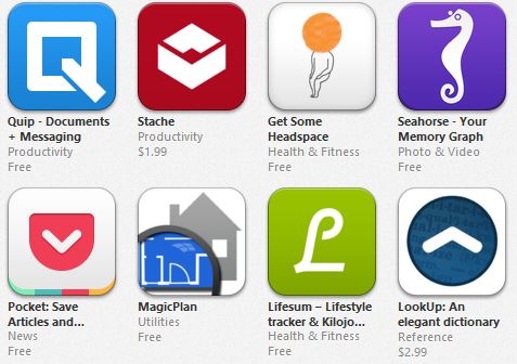
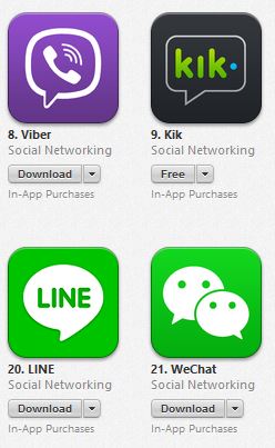
- It gives an idea of what the app is about. The name of your app will be under the icon, but the image you use should still refer to what your app is about. Many camera apps for example use a lens picture. Messaging apps use a green speech bubble. This allows potential users to instantly identify the category that your app is in.
- It doesn’t blend in with competing apps. While it helps to make the category your app is in obvious, you don’t want it so obvious that your app blends in with other competing apps. See what you can do to differentiate the look from others.
- It matches the design of your app. As this is the icon users will be clicking to launch your app, you want its design and style to match the design theme of your app.
The problem with this list though is that even if you have a beautiful looking app icon that conveys the exact message you want, it might not convert as well as you want (i.e. it might still not encourage users to download your app over the competition). So you’ll want to test it first. How do you do that?
What most people do is show their designer samples to their friends or peers and ask “Which one do you like?”, or “What do you think about this one?”
The problem with this approach is that the question is asked out of context. The icon may look great, but compared to what?
A better approach would be to mix in your designer sample with some competing apps. Then ask your friends / relatives / peers “which of these apps would you want to use?”
No additional information is needed about what the apps are, what features they have or even what the names of the apps are. Just have them judge which app they would use based on the appearance of the icon. And definitely don’t tell them which icon is yours, since you don’t want any bias.
Do the test a few times until you see a consistent winner being picked out among different audiences. If the winner is your app, congratulations! If it’s not, then compare your icon to that of the winning app. What is it about that app icon that attracts users to it? Can you add those characteristics to your icon?
Keep doing the test until your icon is chosen as the winner. You may need to increase the audience size so that you have new people confirming whether any improvement has been made.
Over time, you’ll find yourself recognizing what the traits of good icons are. See if there are other areas in your app design that you can apply these traits to.
In the process of doing these tests, you may find that the results surprise you. Perhaps the winning icons weren’t the best looking ones. At the end of the day, it’s downloads and sales that count, so pick the design that converts the best, rather than the one that looks the best.