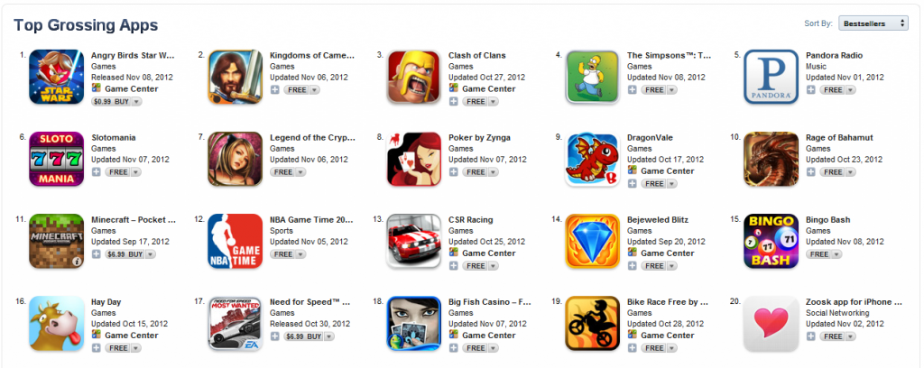
One of the most important aspects of creating a successful app is to make sure it has a great icon. With over a million apps now on the app store, it is getting harder to stand out. Users are now accustomed to scanning through pages of app icons, while looking for apps that appeal to them. Icons that stand out get noticed first. So if your icon does not stand out, then it becomes harder for a user to discover your app.
Here is a screenshot of icons from the the top 20 grossing app store (Apple) apps (when in doubt, always turn to this list).
What can we learn from them?
- Many of the icons don’t include text, since the title of the app is already provided next to each icon.
- By default, Apple applies a glossy effect to the top half of icons. Here is an example:
 Notice how most icons turn that effect off though.
 - Most of the icons are quite colorful, in order to better stand out from the pack.
- Each icon tends to have a single picture or theme, with the focus around that. The user should be able to guess what the app is about by looking at that picture – which would then be supported by the app title next to it.
- Although most icons use a cartoon like picture, the pictures are quite detailed with elaborate shading and shadow effects. Putting this much effort into a proper app icon suggests to the user that they can expect a similar amount of detail and polish in your actual app as well.
Want more inspiration. Here are some examples of nice icon design. How does your app’s icon measure up to these standards?

