Today is the official launch release for Microsoft’s Windows 8 operating system, which is one of the (if not the) most significant upgrades of the company’s flagship product. I find it interesting to view such launches from big companies, and see what lessons I can learn for my own experience of designing products from much smaller startups. In this case though, they seem to be breaking a lot of common usability principles.
Despite the rise of post PC products like mobile phones and tablets, which people are increasingly using these days, Windows continues to dominate the overall market share of devices that people use to connect to the internet. All new Windows based PCs and laptops that are purchased from today on, will come with Windows 8. So needless to say, a lot of people will be using Windows 8 over the next few months.
Unlike previous upgrades of Windows however, there are some significant differences with Windows 8.
- The operating system has been significantly overhauled to now integrate a new modern UI view, that provides a better experience with touch enabled devices.
- There are actually two versions of the operating system being released – Windows RT and Windows 8. Users must decide whether they want the full version of Windows 8, or the tablet specific version, Windows RT.
1. Don’t try to Be All Things to All People
One of the taglines that Microsoft has used to compare this new version of Windows, with other operating systems like Apple’s iOS or Google’s Android was a no-compromise design.
From the start, our approach has been to reimagine Windows, and to be open to revisiting even the most basic elements of the user model, the platform and APIs, and the architectures we support. Our goal was a no compromise design.
The problem with this approach is that right from the beginning, they have set the standard and expectations too high. By trying to combine elements from tablets and mobile devices with a desktop environment, they are trying to be all things to all people, which is an impossible task.
Here is an example of what greeted me the first time I launched Windows 8 on my desktop computer. I expect others to have a similar experience.
 It looks great, but it’s now waiting for my input. Normally I’d expect a login screen where I enter my password, so why am I seeing this screen instead? If I click on the screen, I see a little bounce effect, suggesting there is something underneath for me to see. Using my mouse pointer, I found that I was able to drag the desktop up and out of the way to reveal a login screen underneath.
Each time I boot up my computer now, I have to go through this extra process to access the login screen. The reason for doing so makes sense if you were using a tablet or device with an exposed screen. Exposing the login screen up front may trigger spurious inputs when moving the device. I.e. I might accidentally brush up against the device, causing the tablet keyboard to show and start inputting characters that I didn’t want. By having this extra screen “protection” they make me go through the extra step of dragging the screen away (which would be harder to do by accident), to make sure I really want to login.
However, I’m not using a tablet – I’m using a desktop. So this extra step is wasted.
2. Figure Out What People Want to Do, and Make it Obvious
Next, let’s look at what screen is shown to me after I enter my login details.
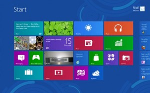
This screen obviously looks a lot different than the traditional Windows desktop that people are used to. It provides a summary of different aspects of the system, such as new emails, photos, access to music, finance etc.
The problem again is that, this may look great on a tablet, but on my desktop, the first thing I usually do is launch my Chrome browser. How do I do that from this screen? (I see an icon for Internet Explorer, but no Chrome – wonder why?).
It is possible to scroll further right, which has some frequently accessed applications, but not all of them are there. In the old Windows, you had a Start menu, and you could then click on Programs to find all the programs on your computer. That option does not seem to be here. So what to do?
The answer is that you can return to the old desktop by clicking on the bottom left or top left corners. I found that out by randomly clicking on different areas of the screen. I’m not sure how a typical user would know this. You can also press Esc to… escape from this screen.
3. Don’t Remove Basic Functionality from Previous Versions
The good news for loyalists of previous versions of Windows is that the old desktop is still there, and most of it looks fairly similar to how it looked in Windows 7.
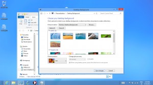 Except for one small thing that is missing. The start button on the bottom left. The button that was probably used the most by users to find and access programs, files and settings on their computer. It’s now gone.
I remember how much trouble Microsoft went to educate people on how to use that button. It was the only button you needed to know to use Windows!
Now though, when you press that corner… nothing happens. Fortunately, if you overreach that corner and click the bottom left corner tip of the screen you are back at the previous modern UI screen.
Oh, there’s the Start button. Let me click that (since that’s what I’ve been trained to do for the past 17 years). Oh, nothing happens again. They are just toying with me now. 🙁
4. Don’t Make Users Jump Through Hoops
So how do you find programs that are not on the opening screen? Simple, move your mouse to the bottom right corner, and wait for the new Charms menu to open on the right side. Then move your mouse pointer up to the search button. Make sure you don’t stray to the left, since the menu will disappear if you do so.
How do you shut down the computer? Open the charms menu, click on Settings, then click on Power. So previously, what took two steps (Start / Shut down) now takes 3. Similar to the extra steps required to login to the computer.
Being in the tech field, I consider myself experienced when it comes to using new technology. Heck, I like being an early adopter when it comes to using new devices. However, with so many issues that bother me here, I’m curious how laymen users (who probably make up the bulk of Windows users) would react to these changes.





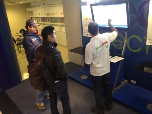 As part of the incubation process, mentors, investors and other visitors were constantly pouring through the building to see what we were up to. Each time, I would present our idea and the progress we were making. This was a great way to get feedback and reactions from a broad group of people. Some of their ideas were added to our own to improve the concept.
 In addition to getting to know our own teammates, being housed in the coworkspace with four other teams helped us get to know others who were in the same position as we were in. While each team had their own challenges, it was very helpful to have members of other teams present to bounce ideas off of, celebrate in their achievements and provide encouragement and support where possible. It was also helpful to listen to advice being given to other teams and look for areas where that same advice could be relevant to us as well.